Bicycle Therapeutics
Precision Guided
A new approach to targeting disease
Read More
Bicycle Therapeutics was founded in 2009 to develop a novel therapeutic modality based on synthetic bicyclic peptides, and to develop these as transformative medicines targeting diseases with high therapeutic needs. Its proprietary platform is based on science first conceived by Sir Greg Winter, winner of the Nobel Prize in Chemistry in 2018 for pioneering work in phage display.
Greenspace was commissioned by Bicycle to support a new phase of expansion and mark a departure from the design approach traditionally taken by life science companies.
We worked on three fronts with Bicycle. The first was for the creation of a brand story. Building on an in-depth research project in which senior members of the Bicycle team in both the UK and US were interviewed, resulting in a new brand film, a new suite of photography of Bicycle’s research and development labs, internal workshops and the subsequent development of the new brand for Bicycle.
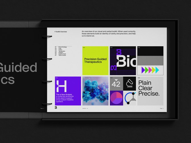
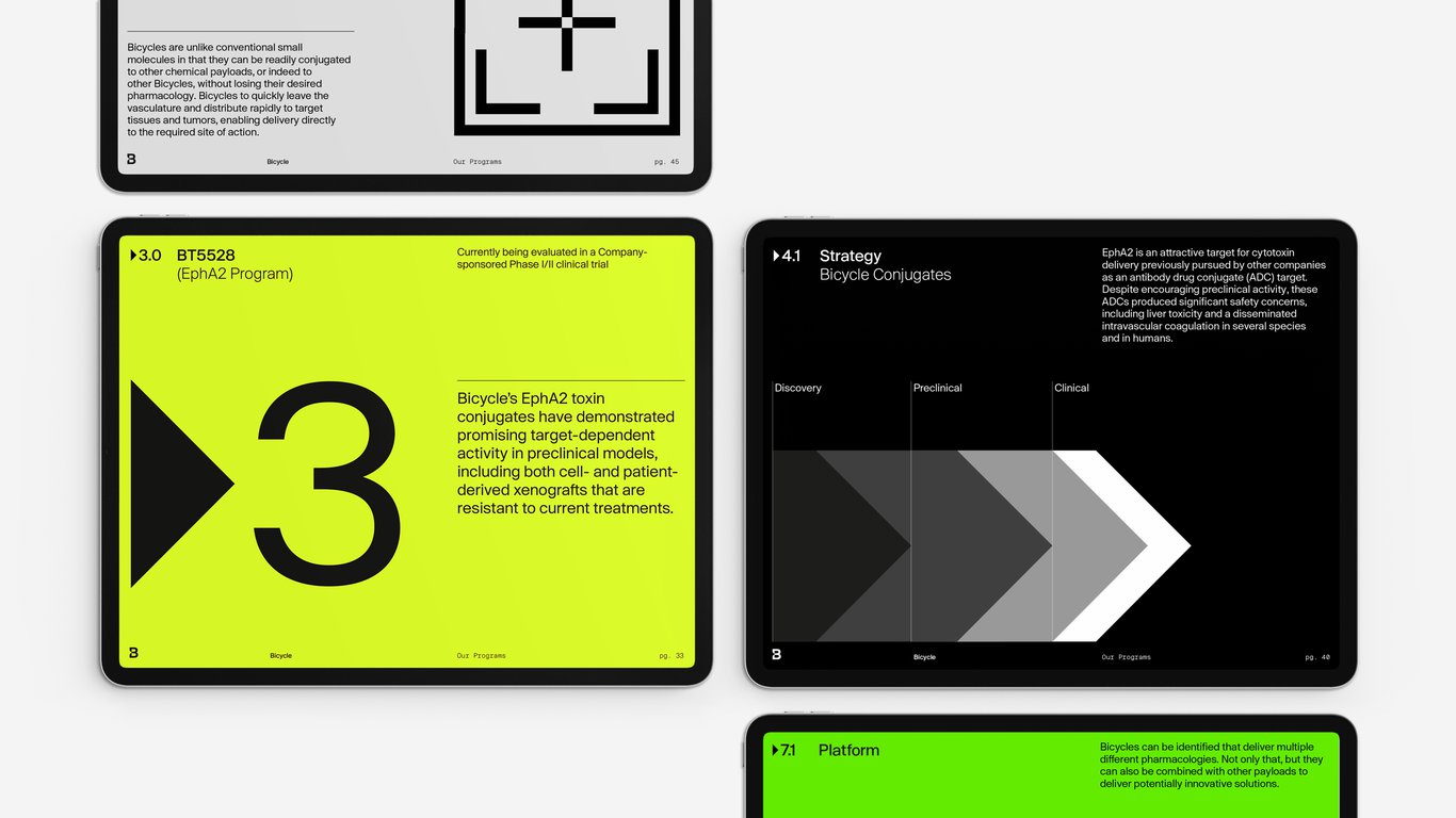
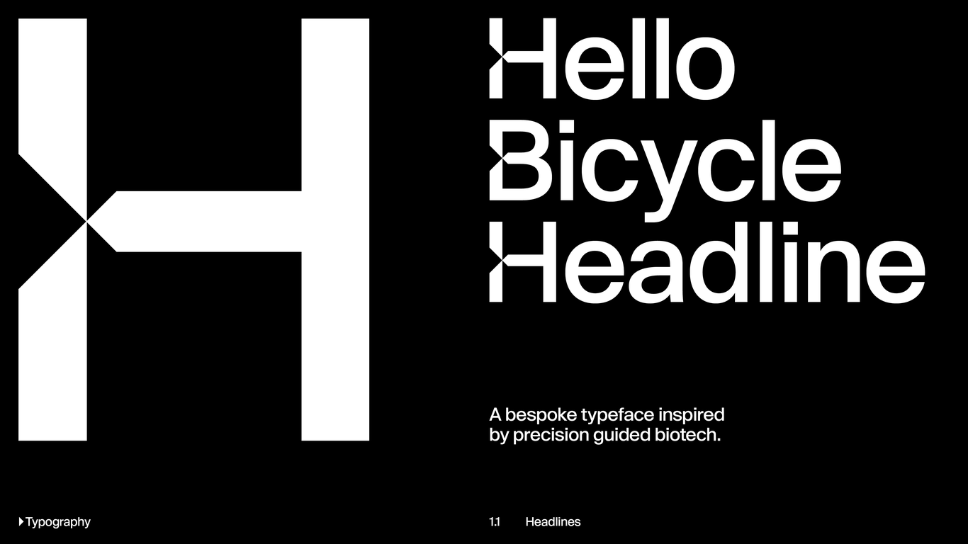
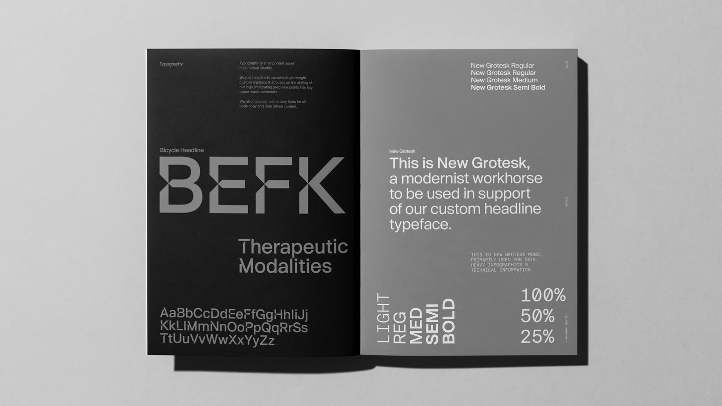
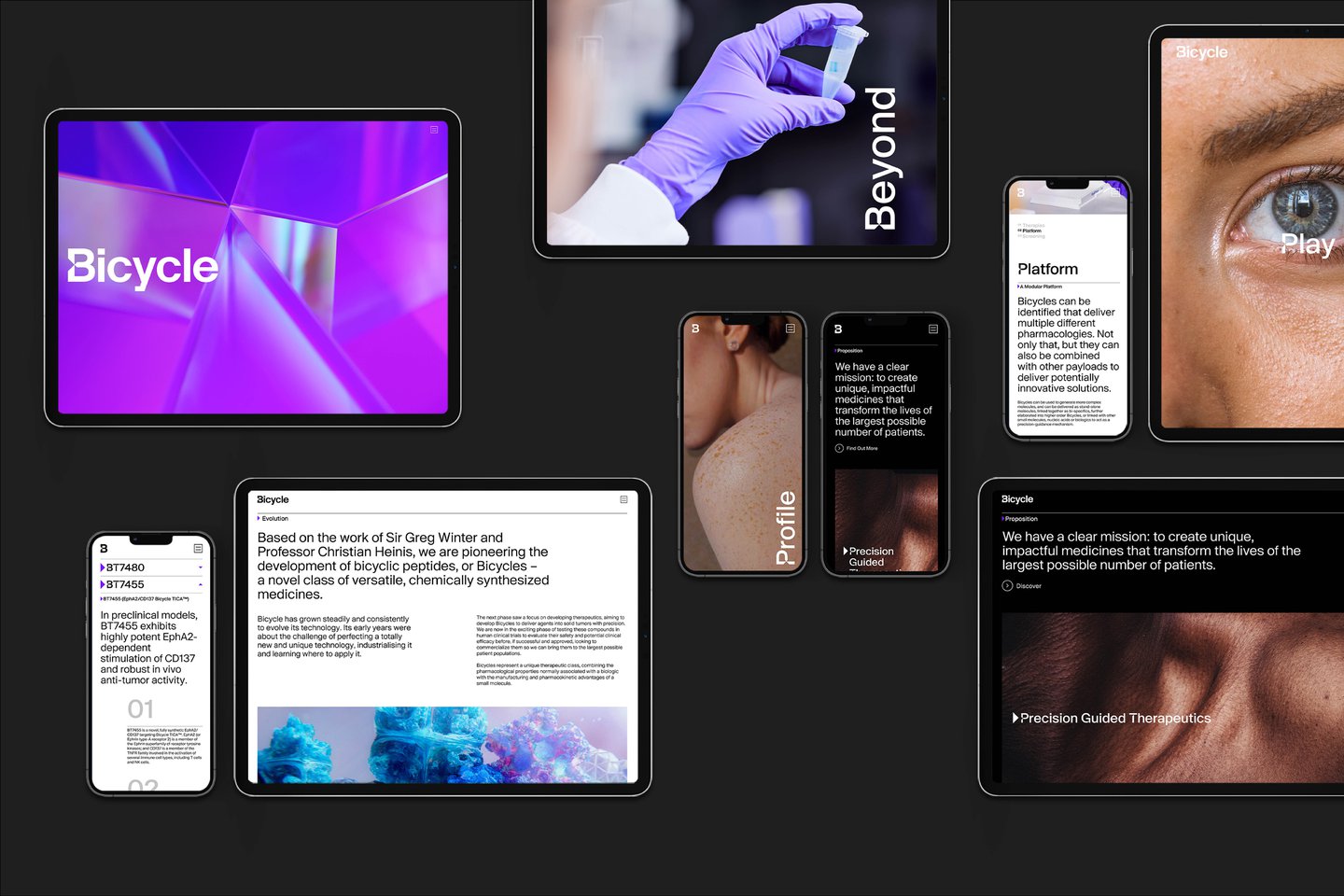
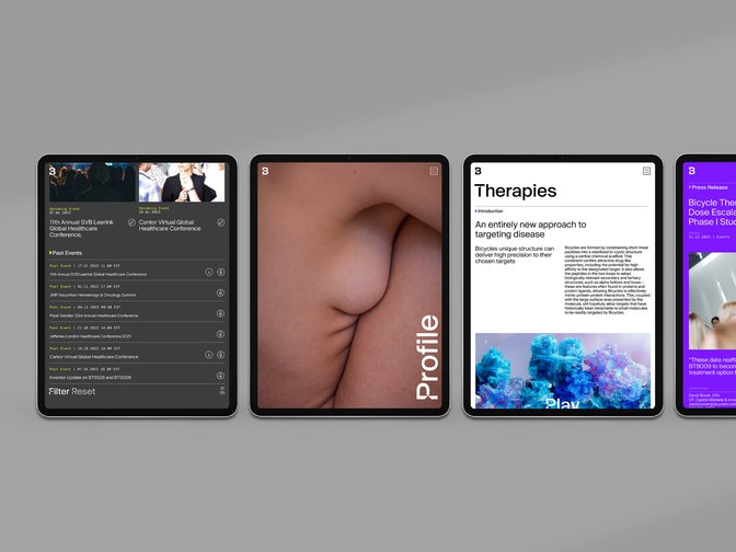
The second was a full overhaul of the company’s brand identity, including logotype, custom typefaces, a vibrant colour palette capturing the innovative spirit of the company and a completely new website. These were finalised following a lengthy consultation process, considering not just the need for a recognisable identity that stood out in the life sciences market, but one which communicated to the scientific community in an appropriate way.
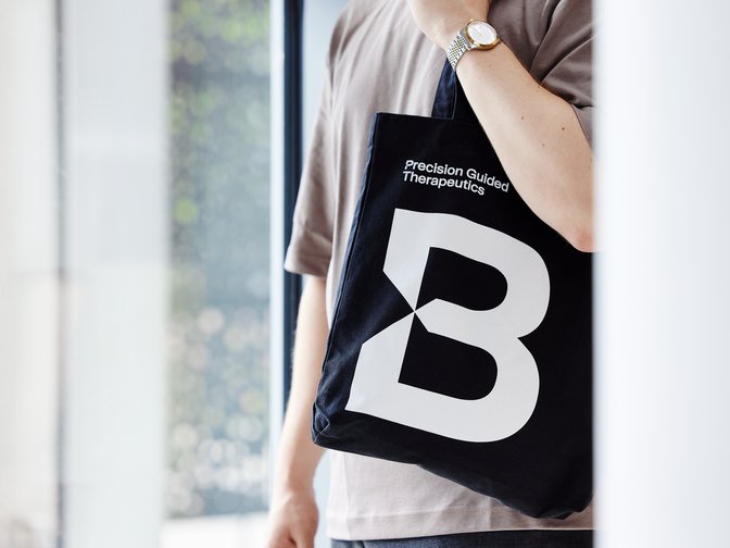
Led by the narrative of the organisation’s unique ‘Precision Guided Therapeutics’ technology, we created an identity that brings clarity and precision to the Bicycle brand. Based around the idea of targeting a source point, just as Bicycle’s technology itself seeks to behave when targeting a tumour without damaging surrounding tissue, this concept was built into the ‘B’ of the Bicycle logotype in the form of arrow-like precision points.
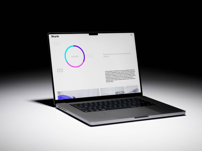
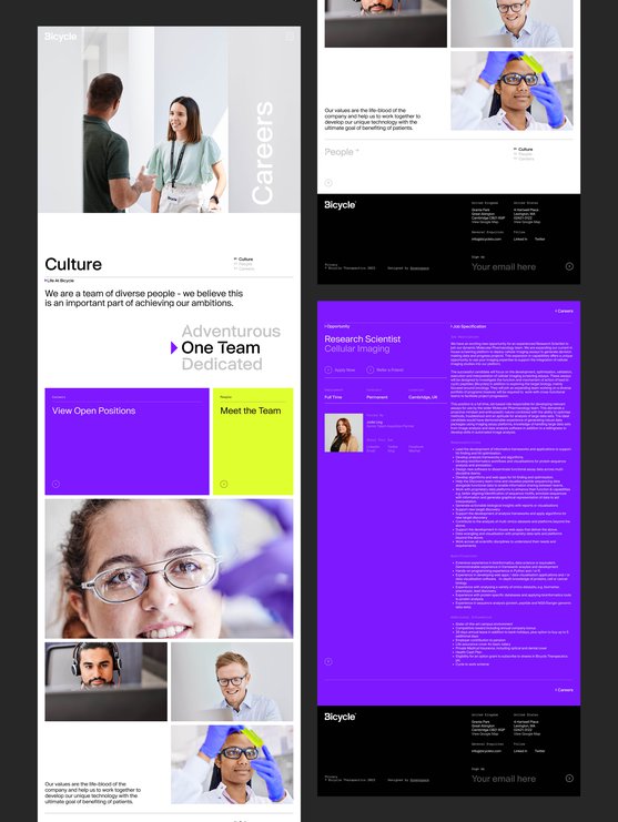
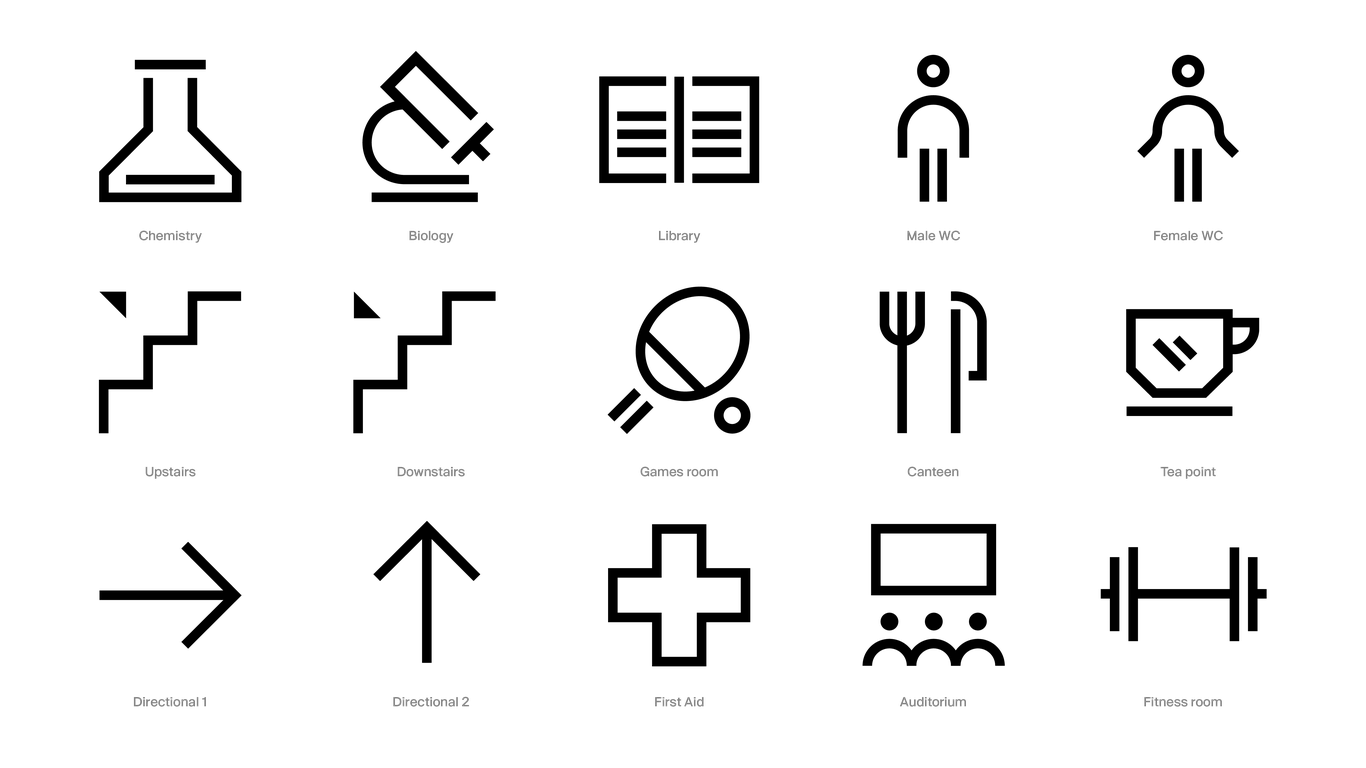
Bicycle’s new website also includes parallax animations produced by Greenspace to demonstrate the operation and application of Bicycle’s innovations, show how they tackle hard tumours in the human body and explain the core science behind them. Additional iconography and animations were created to simplify and unify complex data visualisations related to Bicycle’s work.
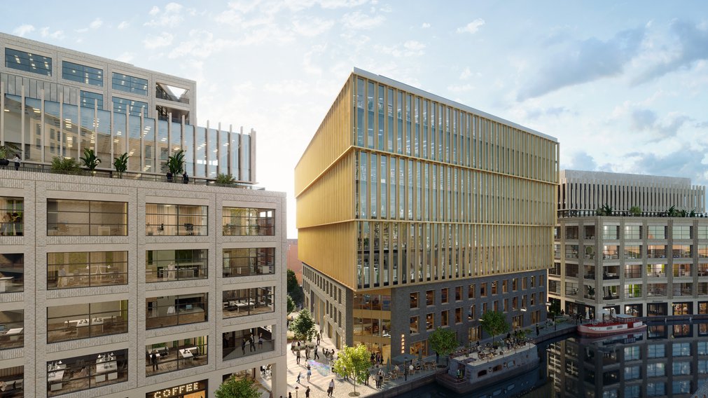
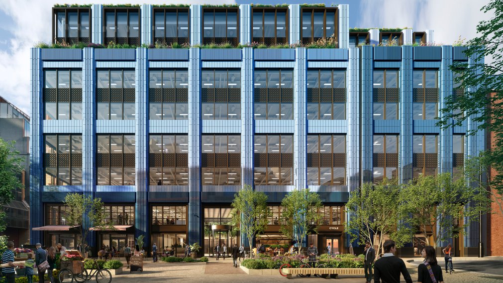
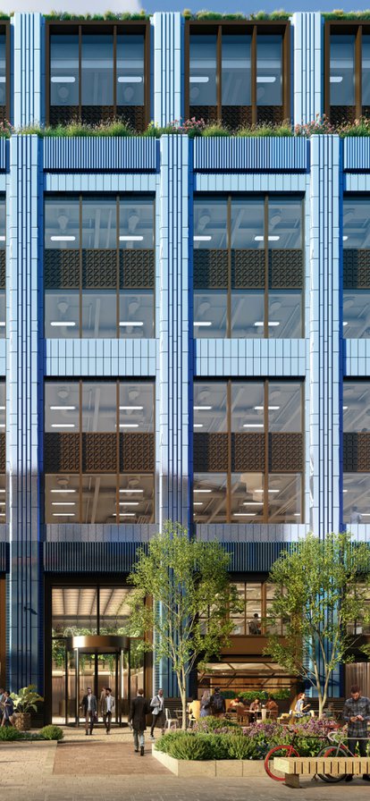
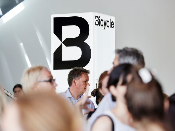
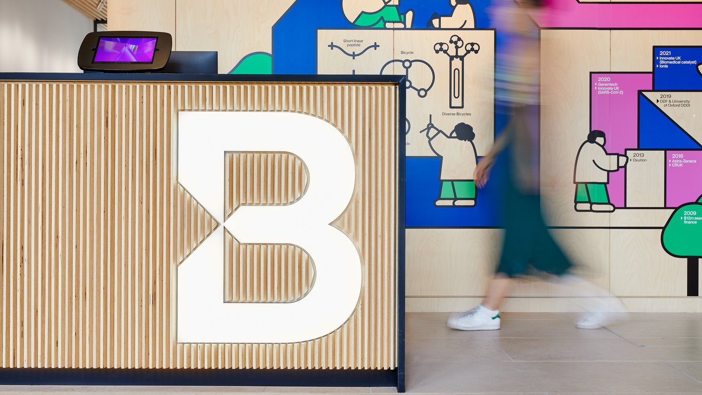
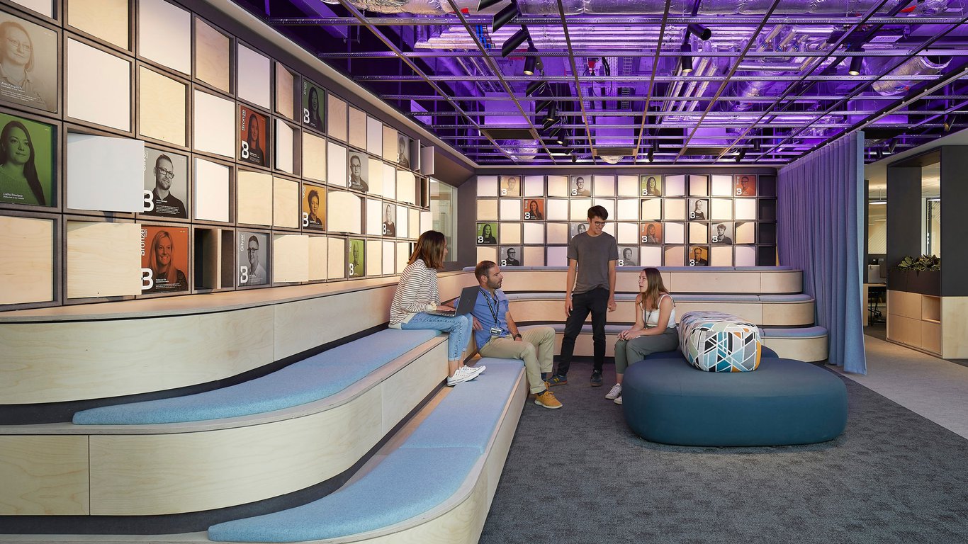
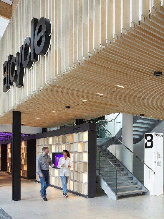
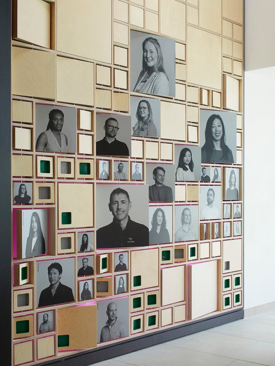
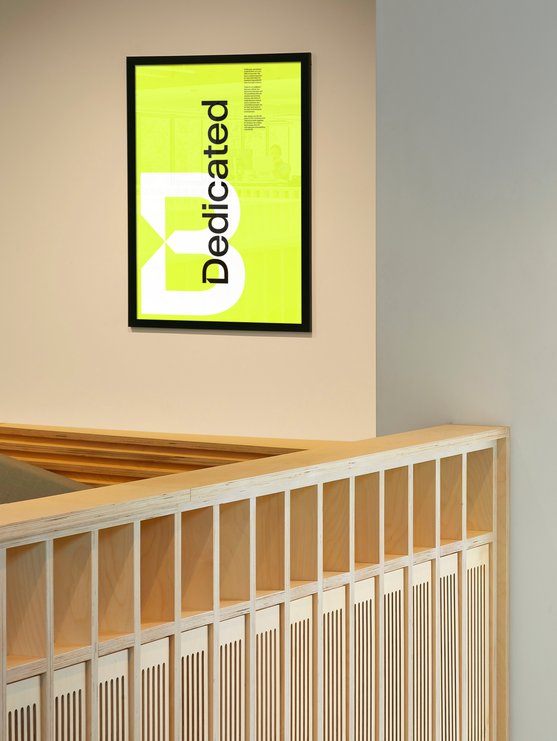
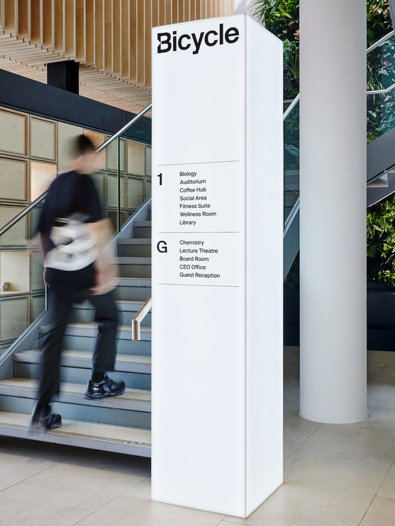
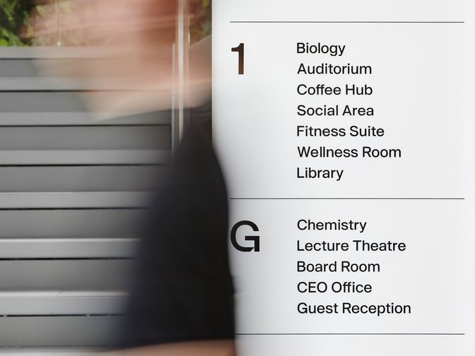
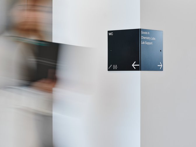
Finally, Greenspace worked on the interior design for Bicycle’s brand new, purpose-built headquarters in Cambridge, creating a world-class visitor experience and workplace for the company, where the brand is applied extensively across a myriad of applications, from wayfinding and workplace interiors, to printed collateral, merchandise, exhibition graphics and events.
Strategy
Visual Identity
Writing
Digital
Motion
Photography
Wayfinding
Interiors
Archive Foundry
James Brocklebank
Random42
Marcus Ginns
Henry Hunt
Pilbrow & Partners
Jing Wei

Full Screen
1/3




An identity celebrating clarity, precision and scientific innovation.





Full Screen
1/5



Full Screen
1/3
3D animated film introduces Bicycle's entirely new approach to targeting disease.

Play
Bespoke type family to reflect a new approach to targeting disease.




A comprehensive digital experience brings to life complex science through a clean aesthetic and targeted behaviours.



Full Screen
1/3

Workplace interior design, wayfinding and interior graphics.
Full Screen
1/4





Full Screen
1/4
See more work
