Sinéad O’Dwyer
For the love of every body
Celebrating body positivity through fashion
Read More
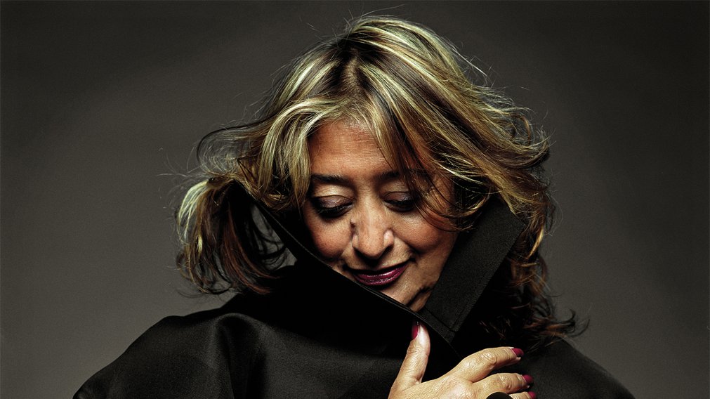
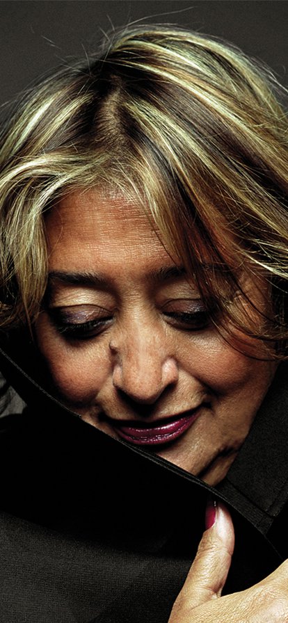
Having graduated from the Royal College of Art in 2018 with a collection unlike anything seen before, one of London’s most exciting designers — Sinéad O’Dwyer — made her debut at London Fashion Week 2019 to showcase her SS20 collection.
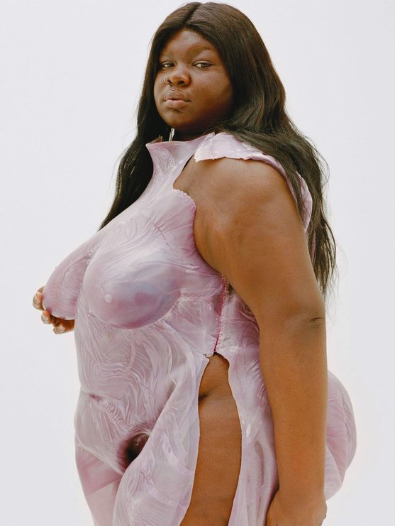
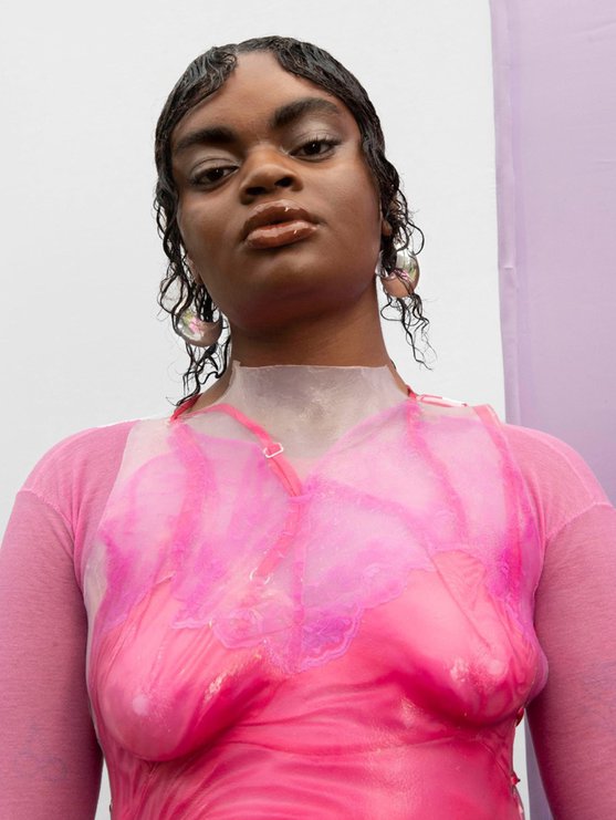
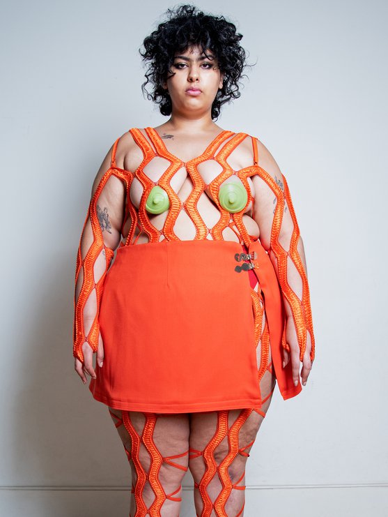
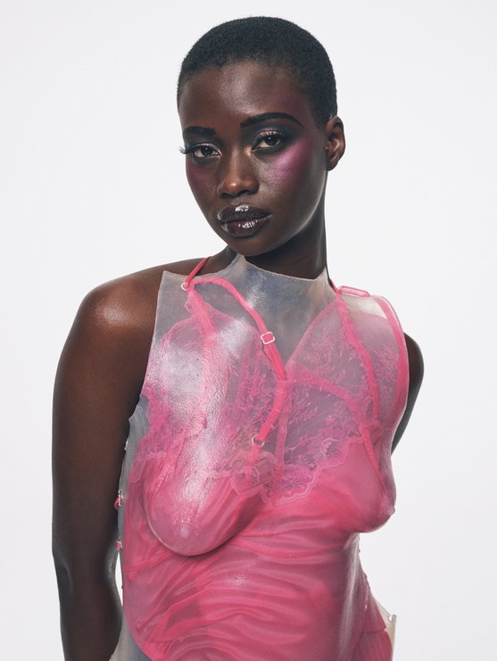
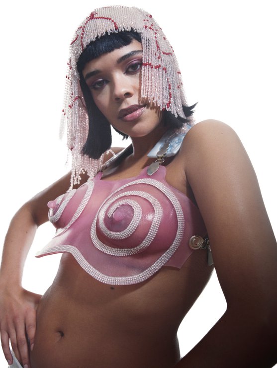
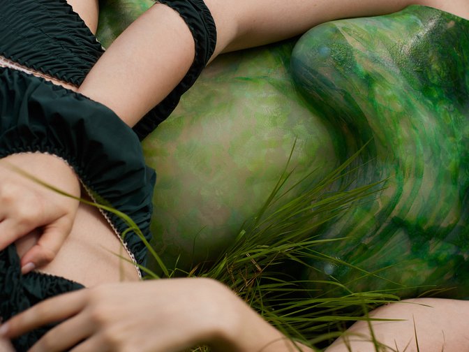
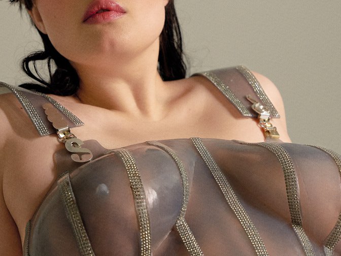
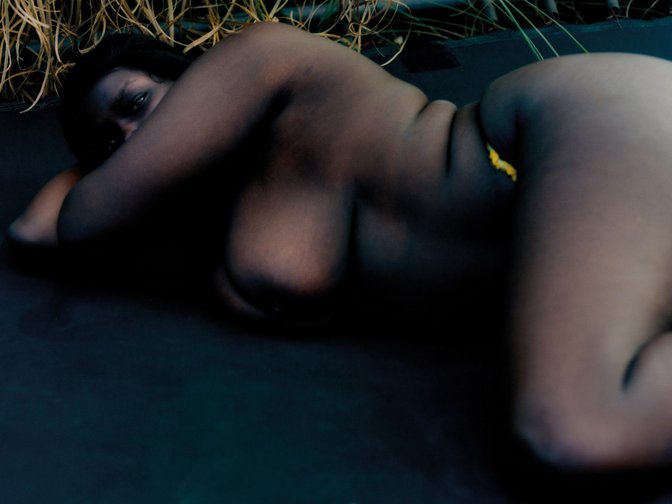
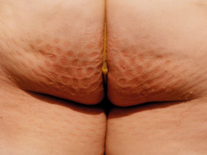
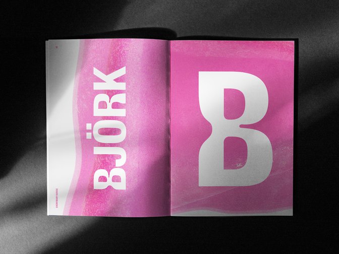
Inspired by Sinéad’s recollections of her and her school friends’ unhappiness with their own body shapes, and with the way bodies are conventionally presented in fashion and the media, the pieces, made from life-moulded silicone swirled with shades of fuchsia, aquamarine, and canary yellow, were worn by a succession of unconventional catwalk models. Greenspace collaborated with Sinéad on the event, ‘Wear me like water’, and designed the accompanying photo zine.
Following this, Sinéad asked us to help her to define and design her own brand. We interviewed her collaborators and mentors, whose insights helped us summarise her approach in the words, ‘For the love of every body’. This became the jumping off point for the identity design.
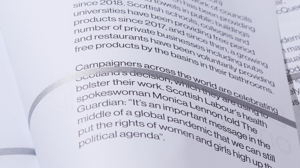
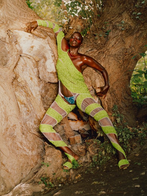
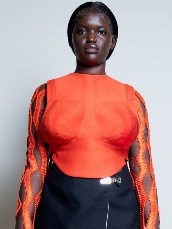
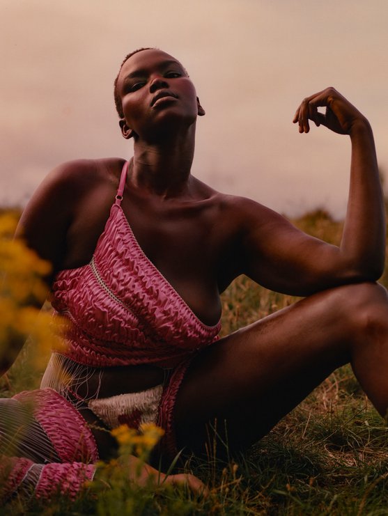
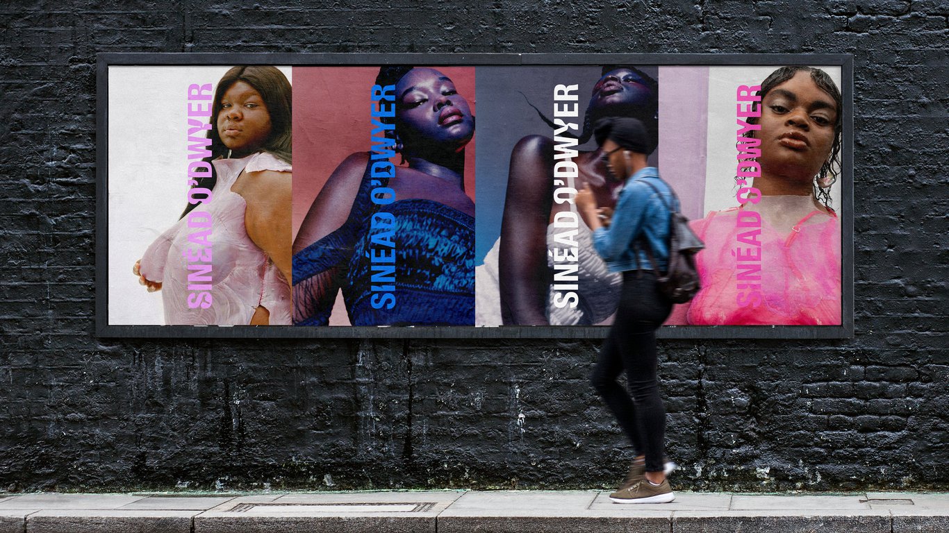
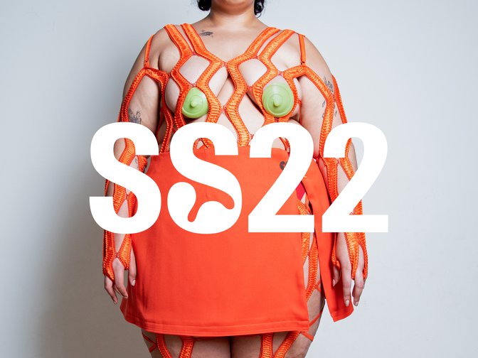
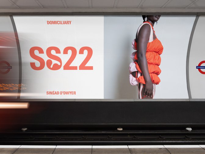
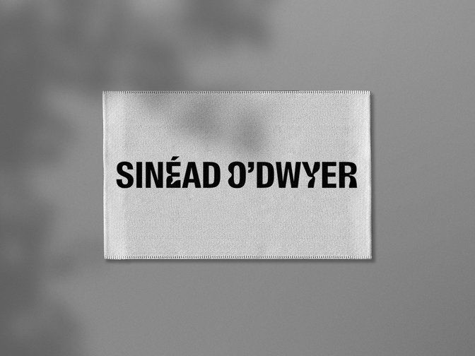
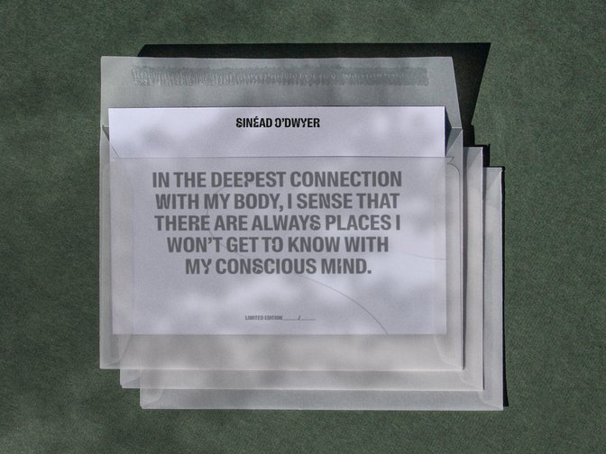
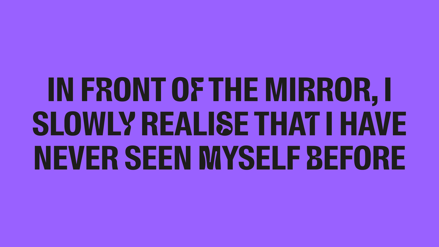
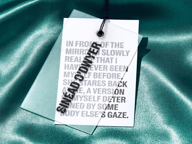
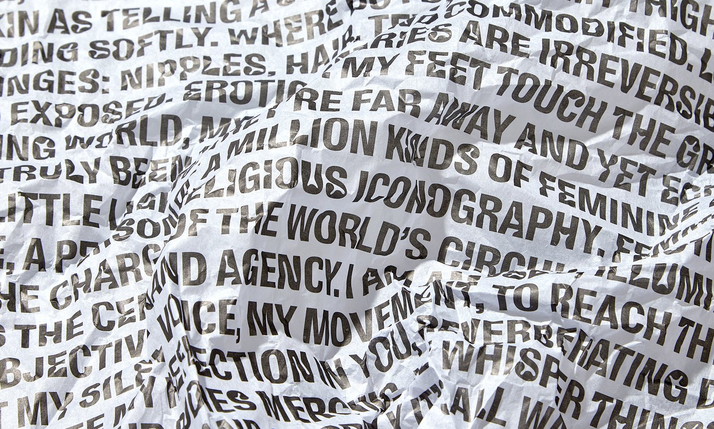
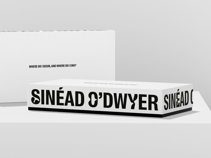
We drew a wordmark, informed by the shapes of undulating body forms, and by the materials Sinéad works with, such as silicone casting. We asked writer Anastasiia Federova, one of Sinéad’s key collaborators, to reflect on Sinéad’s ethos and capture her thoughts in words. The resulting brand, with a bespoke font we developed with the foundry Swiss Typefaces, combines Anastasiia’s poetry with Sinéad’s sensual and tactile campaign photography to create a written and visual expression that feels uniquely confident, unexpected and beautiful.
Strategy
Visual Identity
Typeface
Digital
Packaging
Motion
Swiss Typefaces
Anastasiia Fedorova
James Brocklebank
Steph Wilson
Identity Printers
Full Screen
1/8
Building a brand that celebrates all shapes and sizes.

Full Screen
1/5


Full Screen
1/3
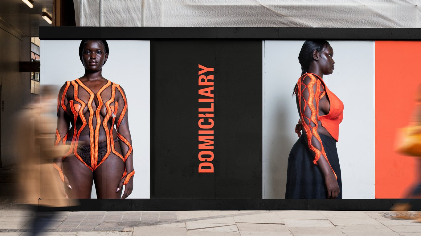

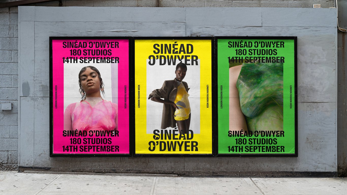

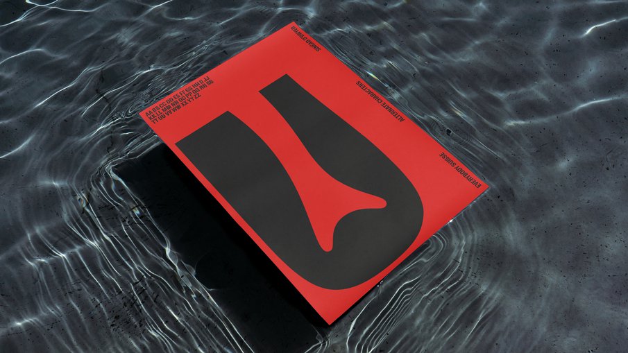
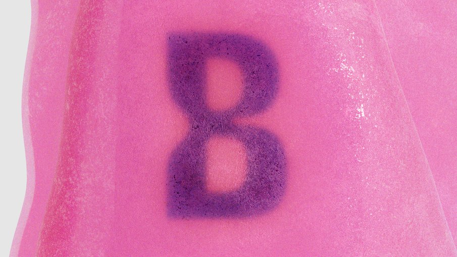
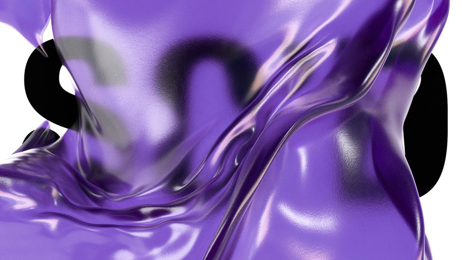
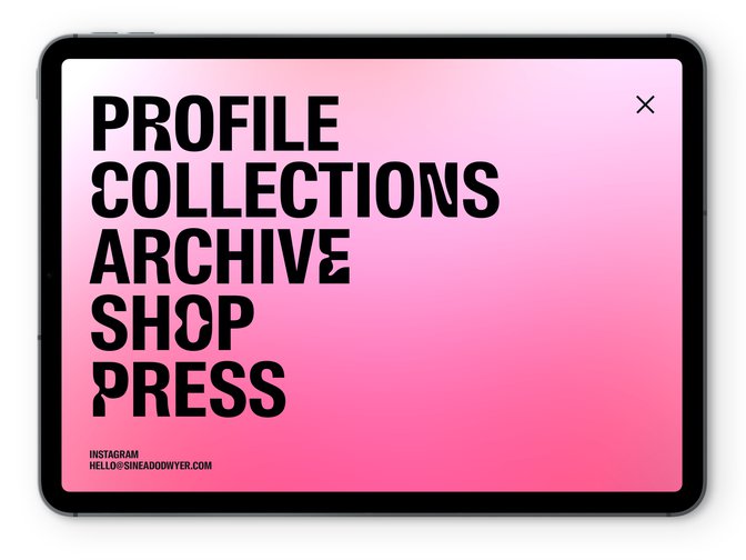
Inspired by the body, Every Body Suisse is an ever-fluctuating font designed with Swiss Typefaces.


Full Screen
1/6
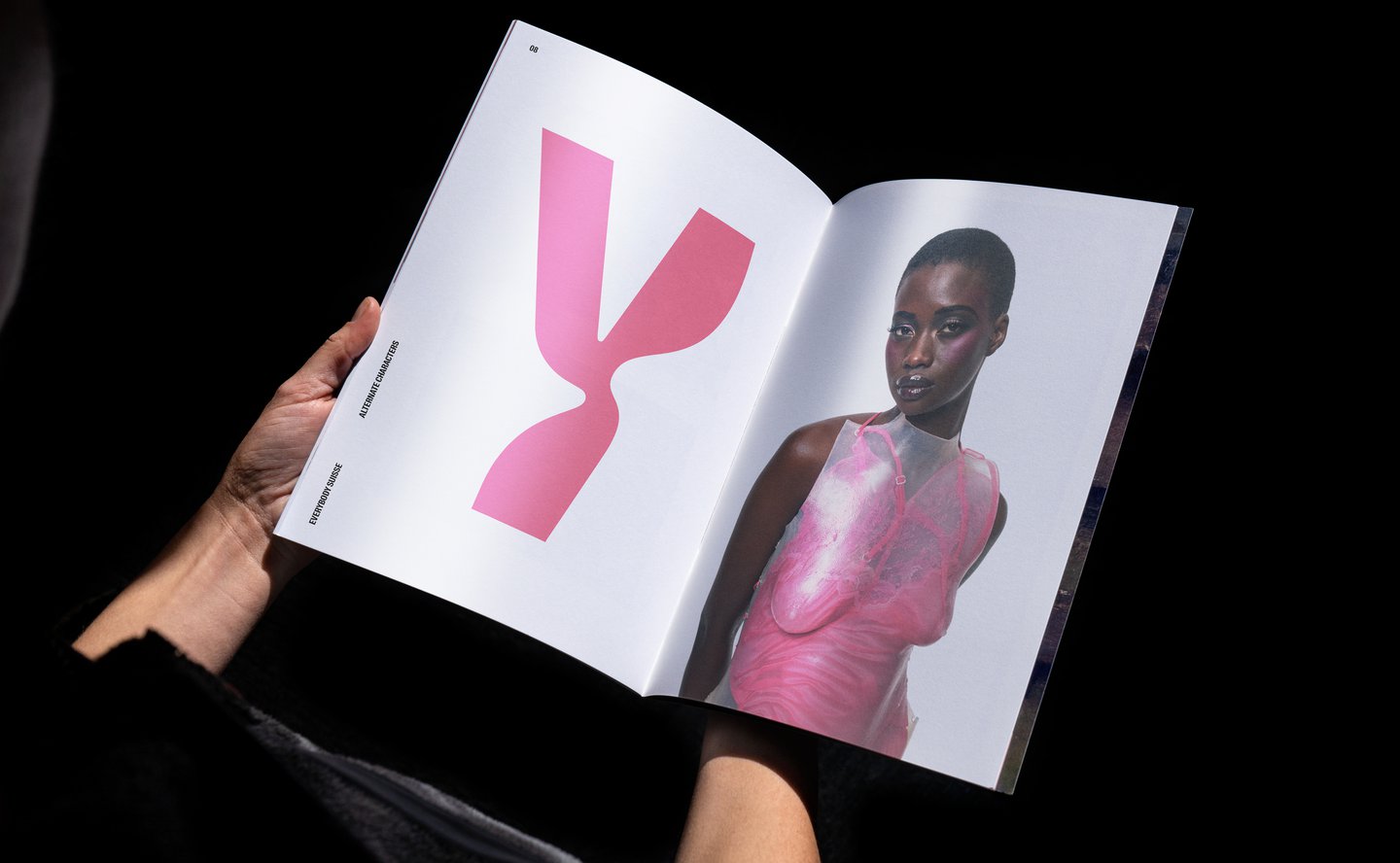

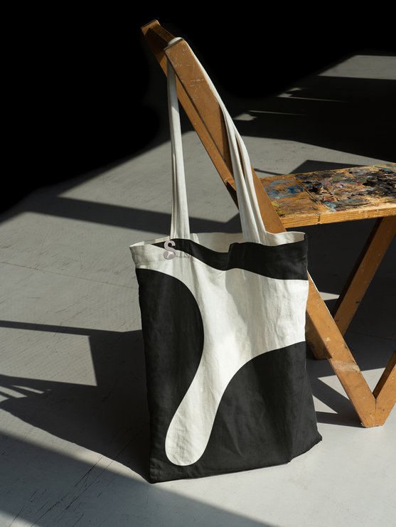
Bespoke packaging incorporating Sinéad’s materials, and poetry by Anastasiia Fedorova.






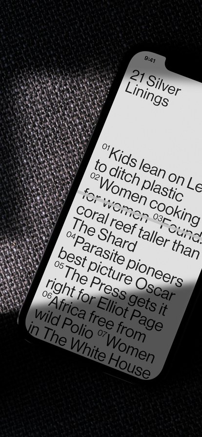
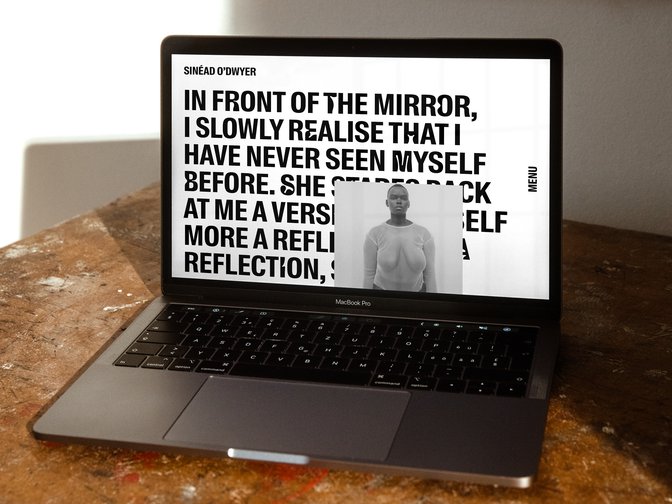
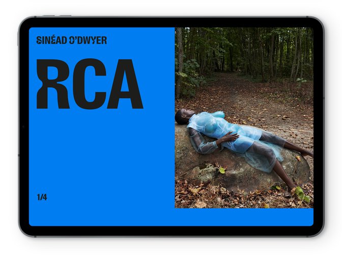
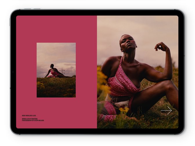
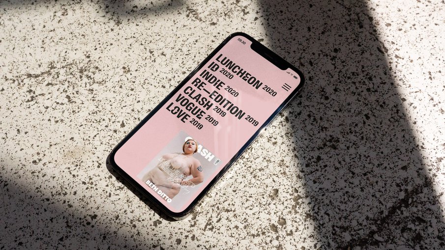
An editorial-style website showcases Sinéad’s story, her collections and collaborations.
Full Screen
1/3

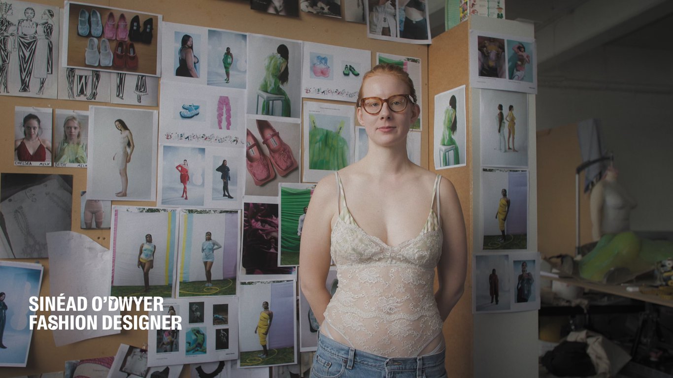
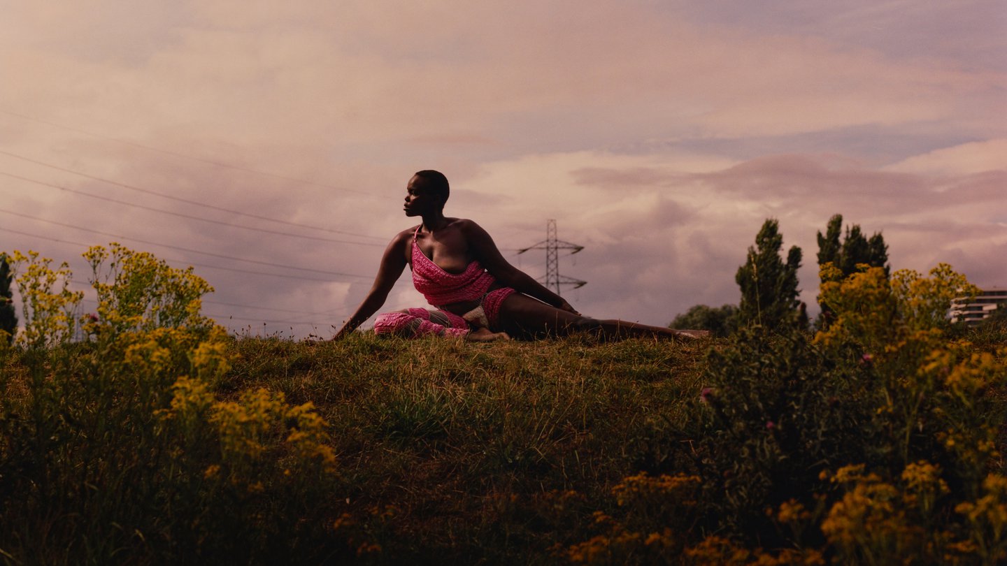
Brand film — For the Love of Every Body — screened at London Design Festival 2021.
Play

See more work
