The OWO
Home of legends
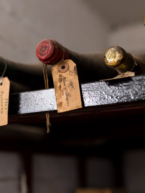
Authenticity and a respect for history
Read More
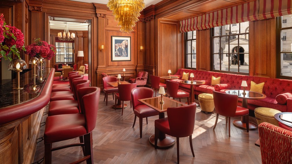
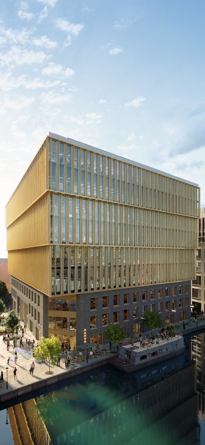
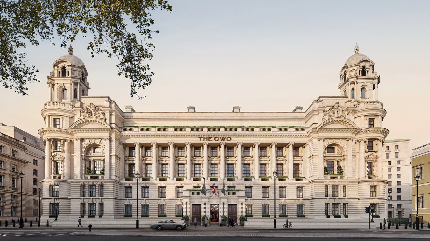
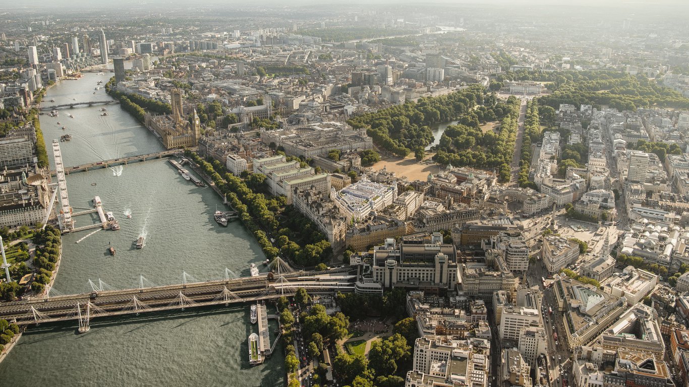
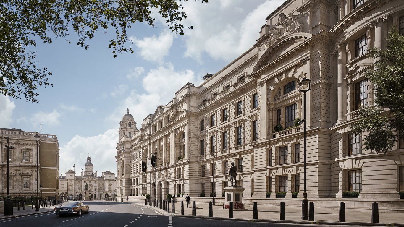
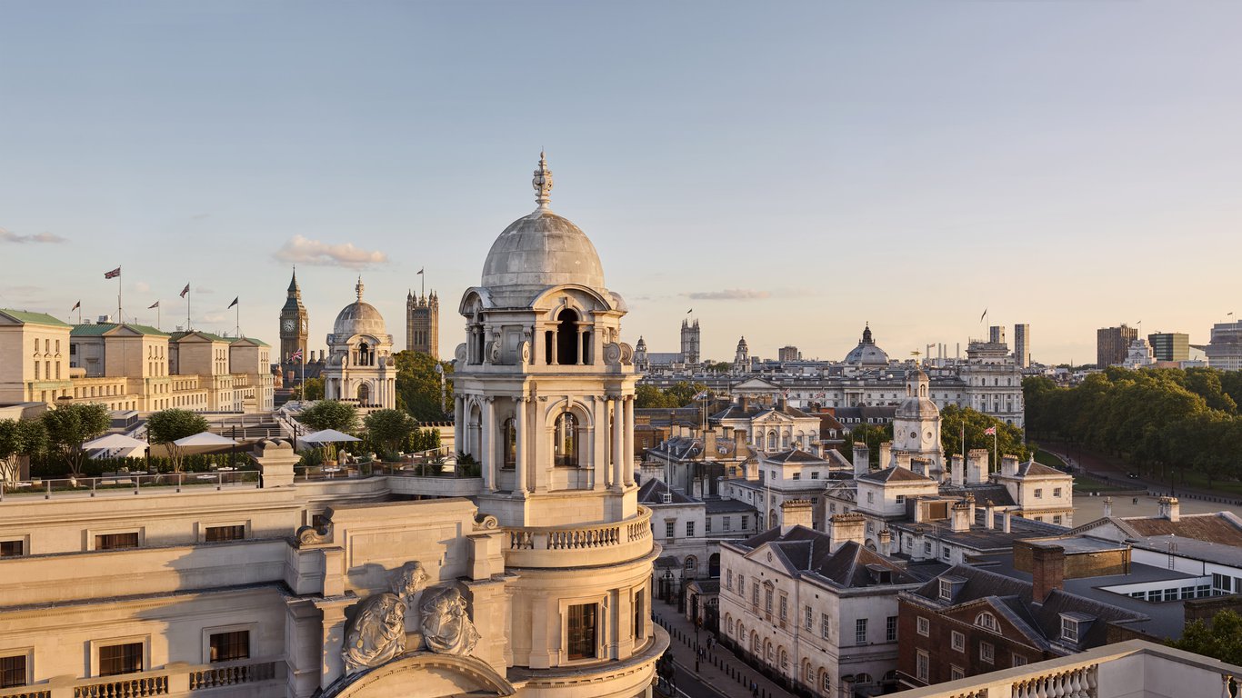
The OWO, formerly the Old War Office, is a new hospitality destination on London’s Whitehall comprising London’s first Raffles hotel along with 85 private residences.
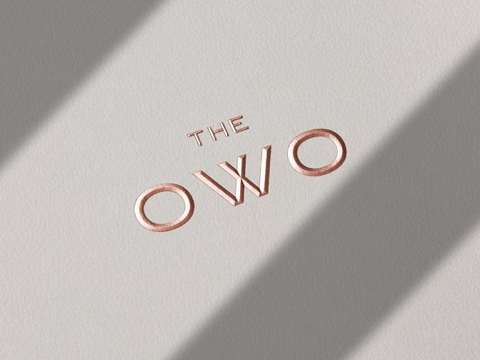
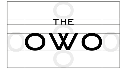
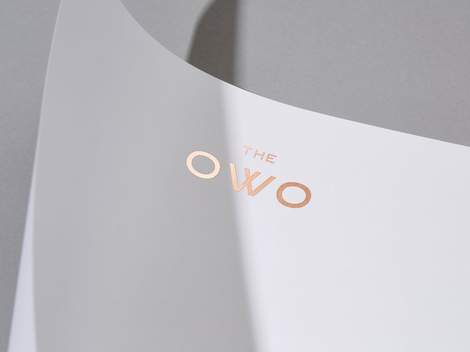
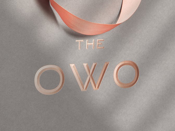
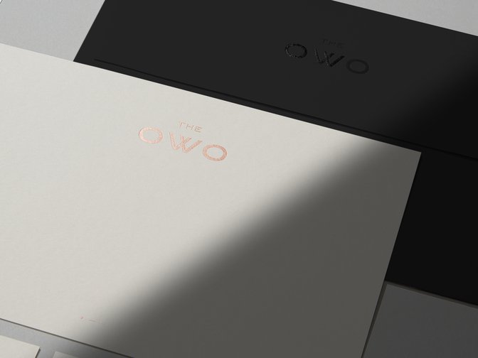
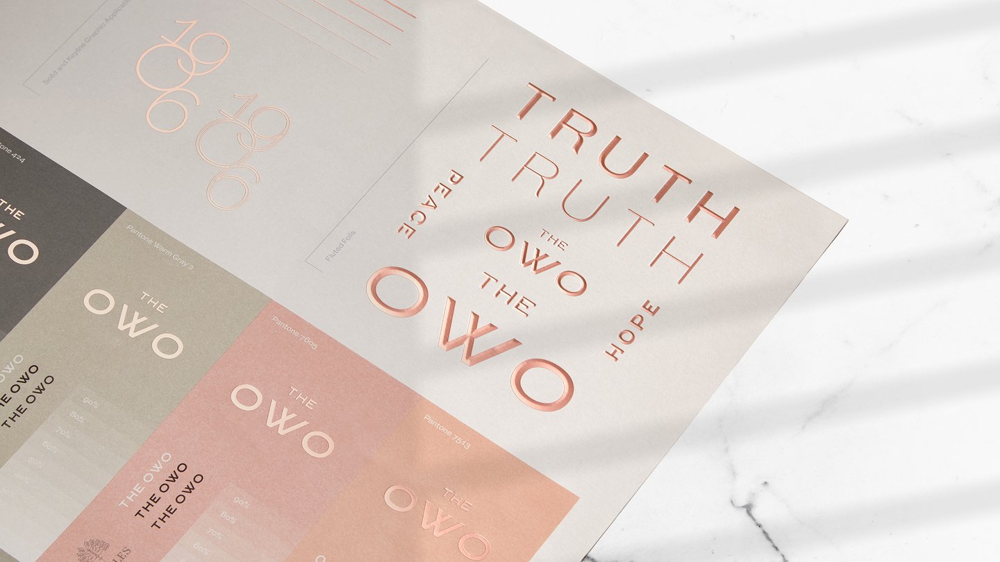
Greenspace was tasked with developing the brand strategy, name and identity that would create a fitting legacy for the destination. Following many site visits, our key insight was to remain as authentic to the building’s history as possible. A look through The National Archives revealed thousands of letters from the Old War Office: almost always, the typist used the acronym OWO. This provided the inspiration for the wordmark and the foundation of the new brand.
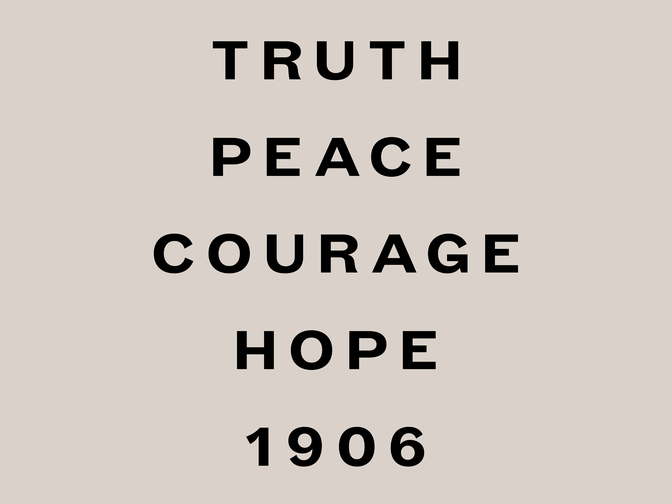
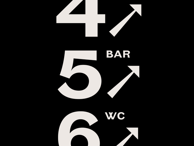
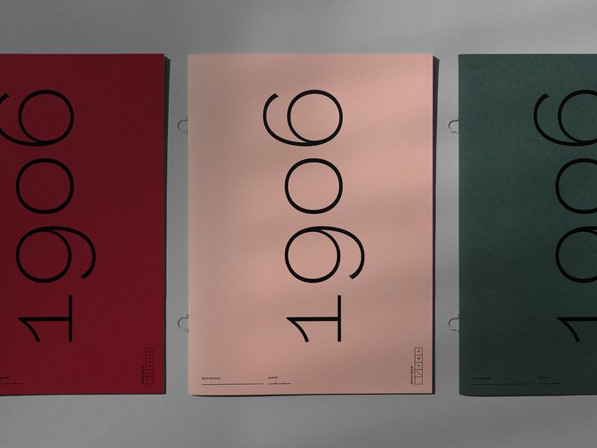
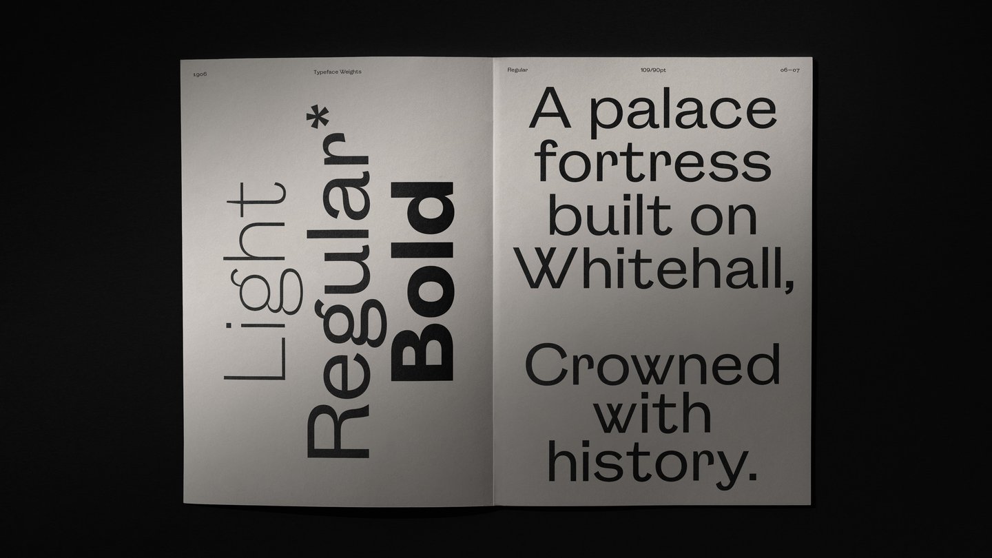
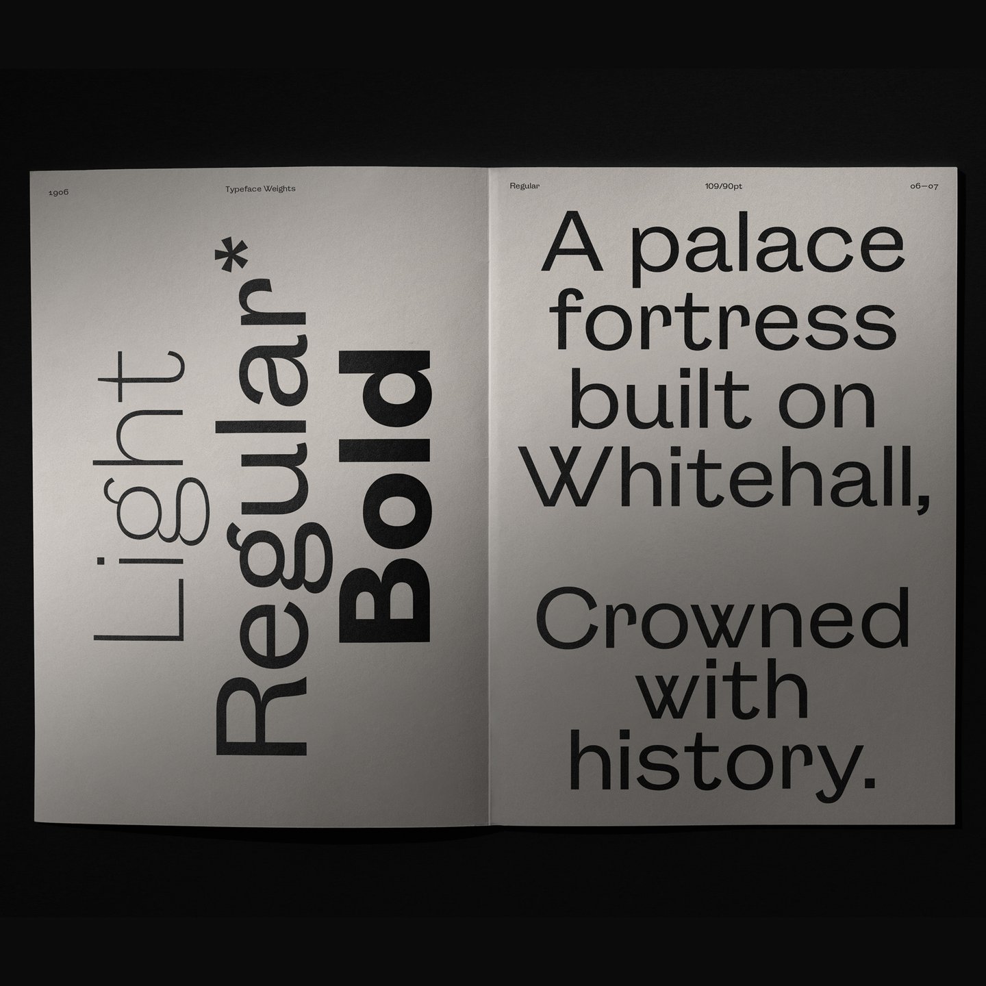
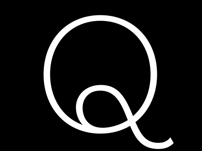
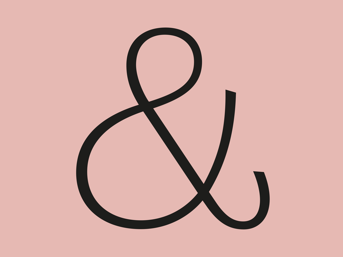
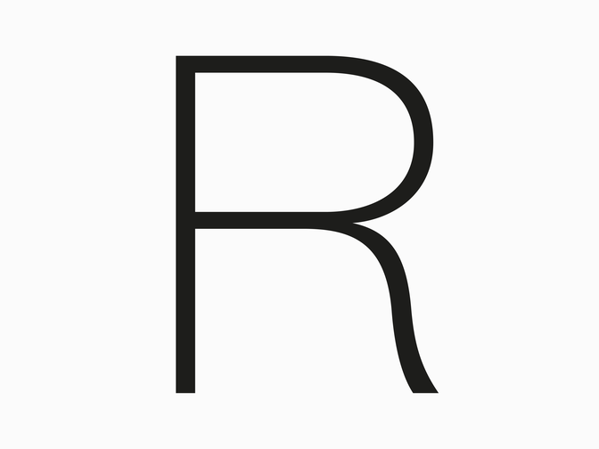
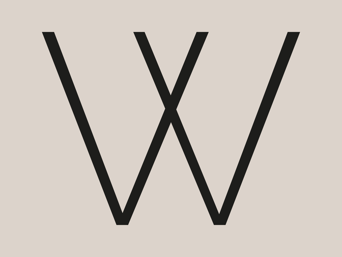
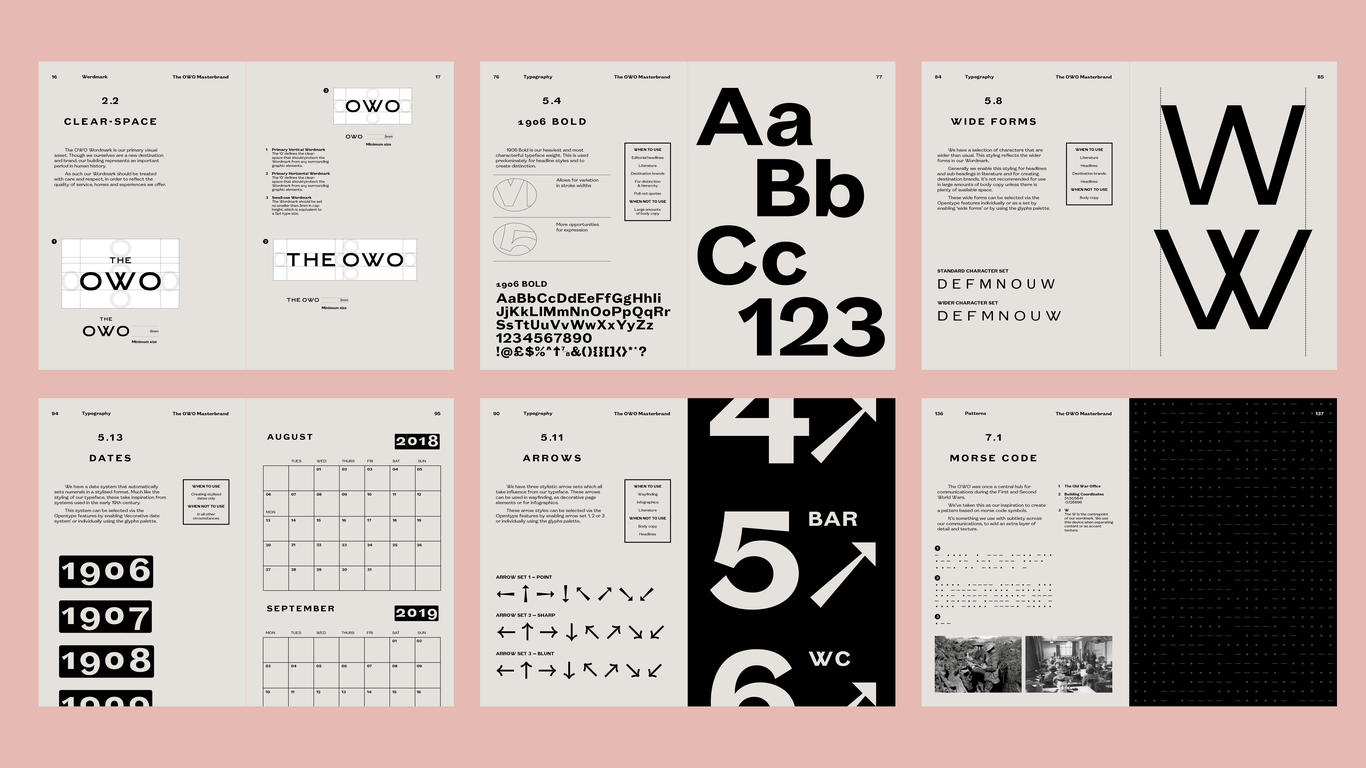
Studying early 20th century Grotesk typefaces by British type foundries influenced our decision to collaborate with Colophon Foundry on a bespoke Grotesk typeface that would work, and be of lasting value to The OWO. The resulting typeface family — with standard characters and alternate flourished forms, for use across all applications, from physical signage to printed publications, and digital media for The OWO — is named 1906, after the year the building was first opened.
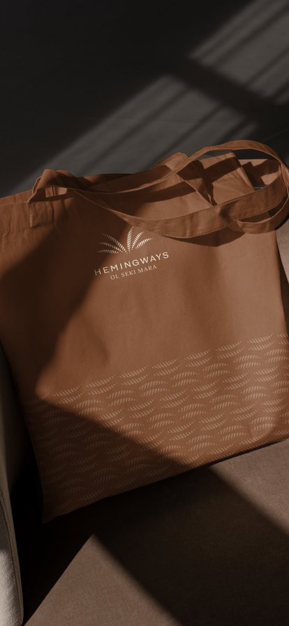
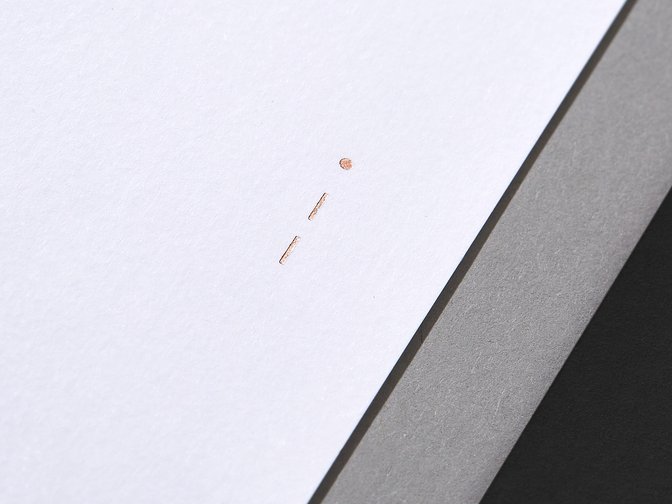
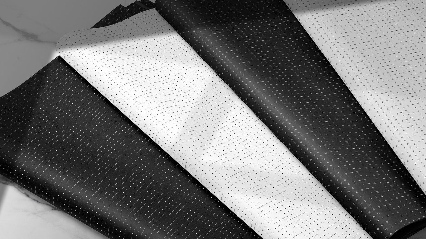
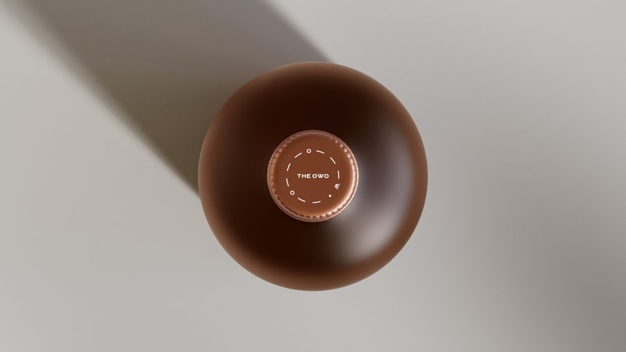
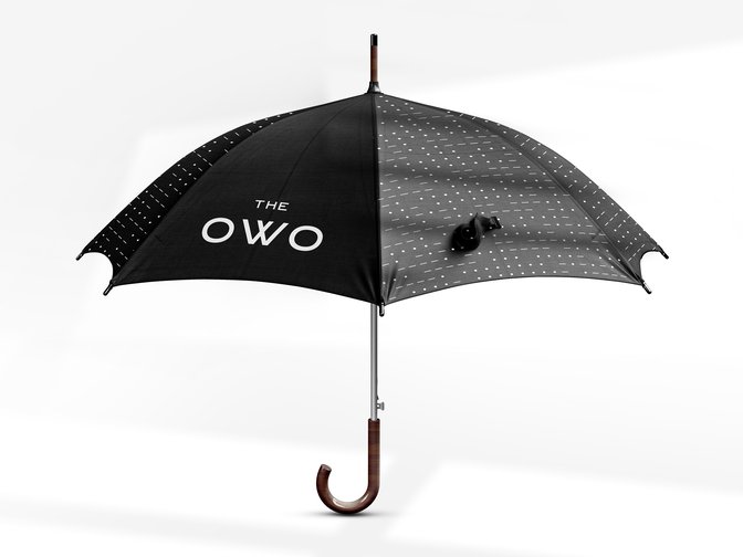
Framing The OWO brand identity is a system of typographic patterns designed to echo some of the sensitive work carried out within its walls, including morse code denoting the geographical co-ordinates of The OWO.
Strategy
Naming
Visual Identity
Art Direction
Typeface design
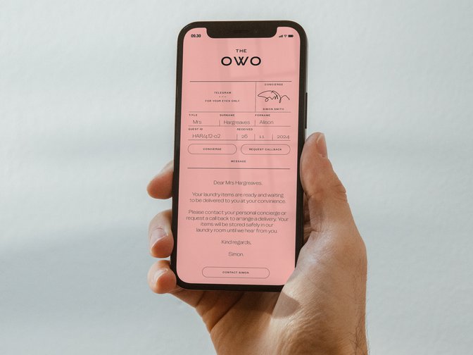
Digital
Motion
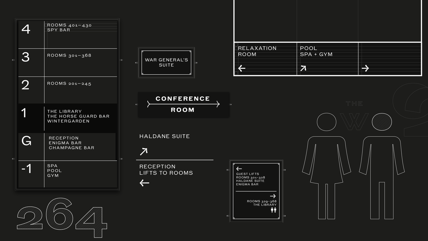
Wayfinding
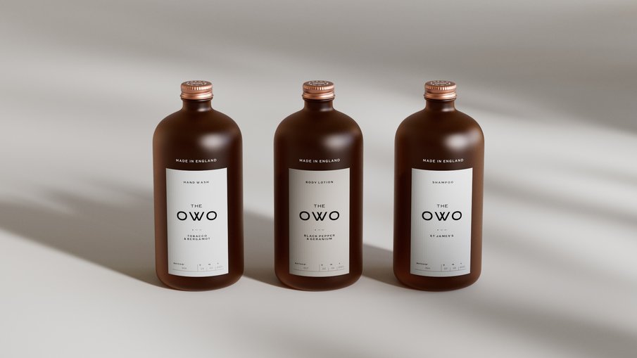
Packaging
Colophon
Sam Bush
Grain
V1
Full Screen
1/4
Full Screen
1/5

1906 — a bespoke utilitarian grotesk typeface, inspired by a world-defining era.


Full Screen
1/4
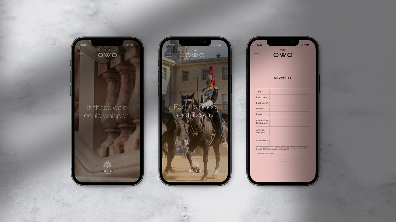

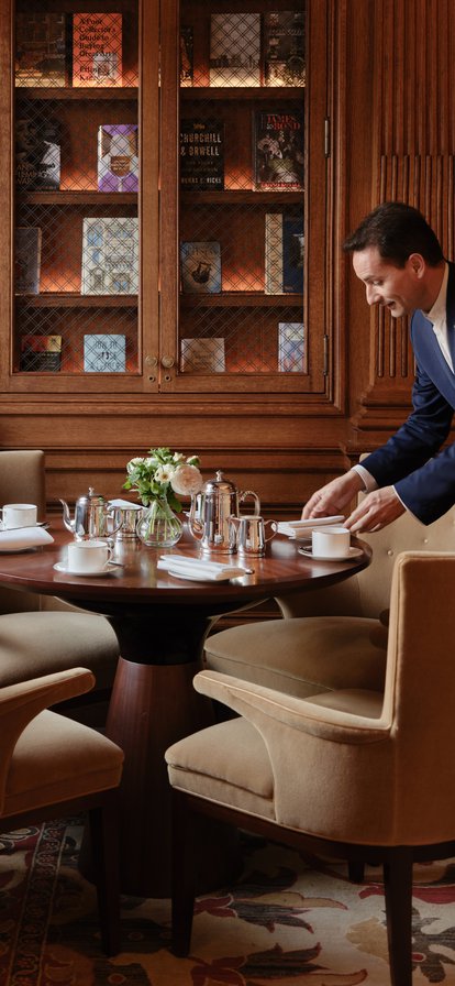
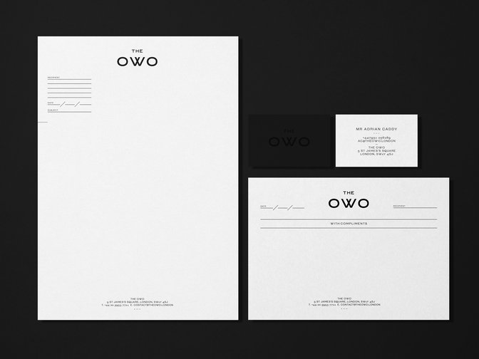
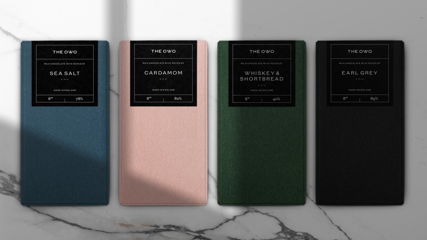
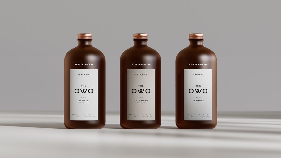
Each and every brand encounter, physical or digital, is rooted in history and underpinned by authenticity.

Full Screen
1/3

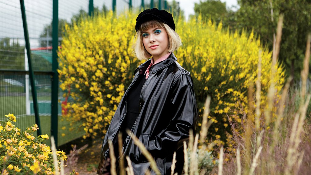
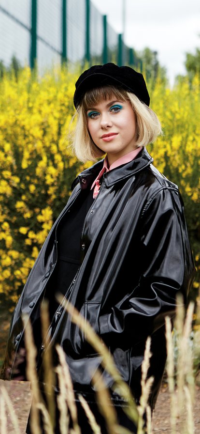
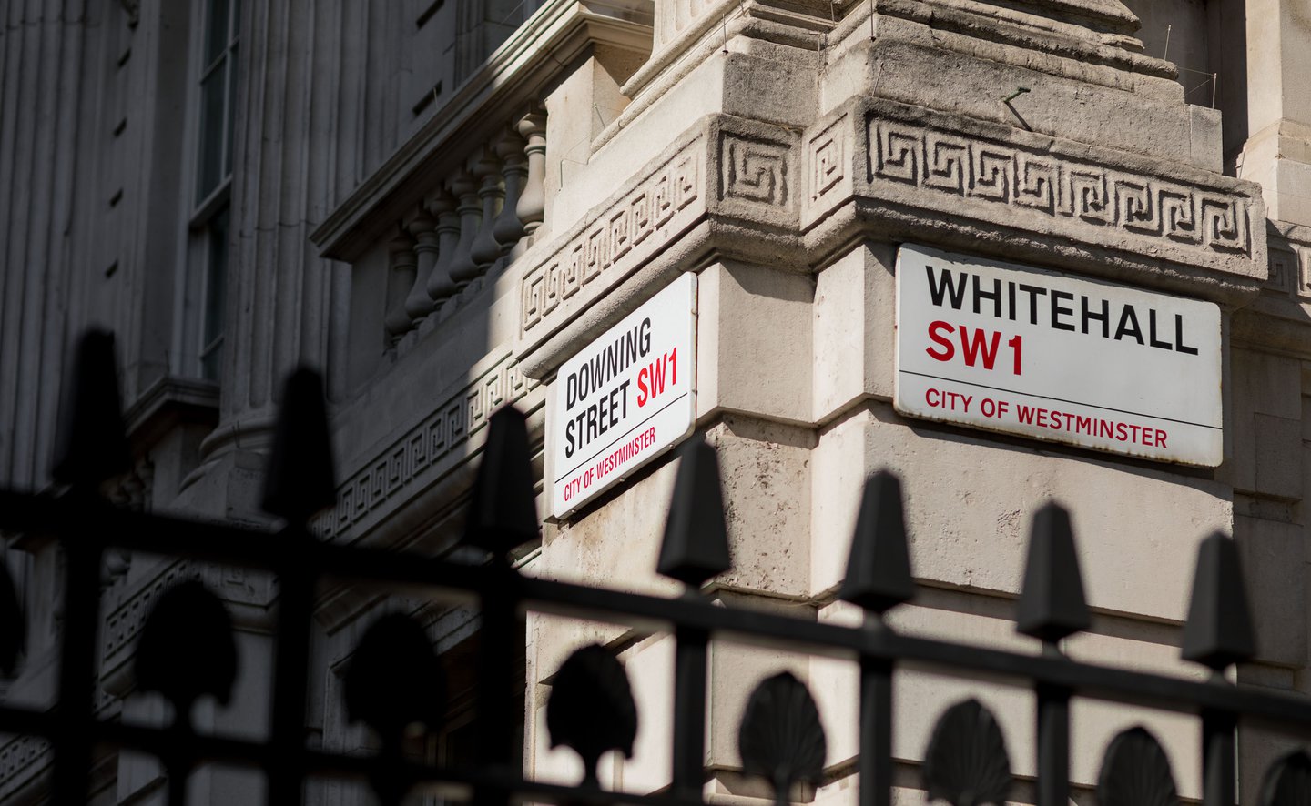
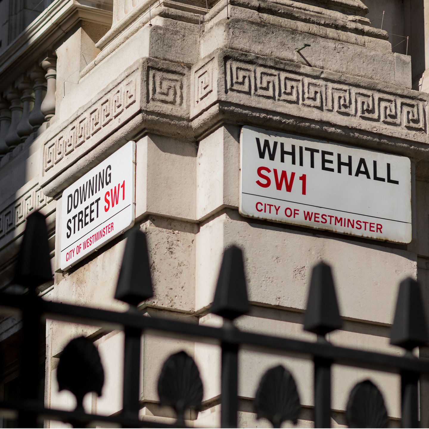
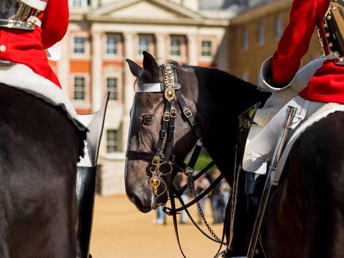
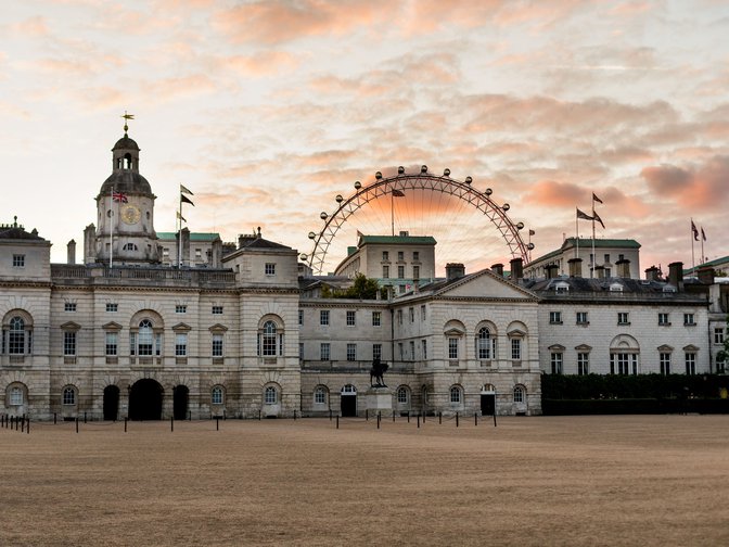
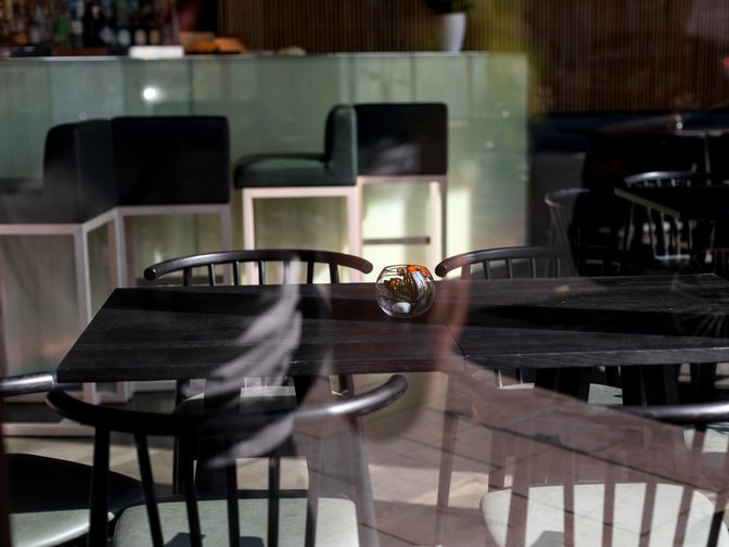
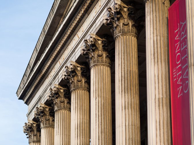
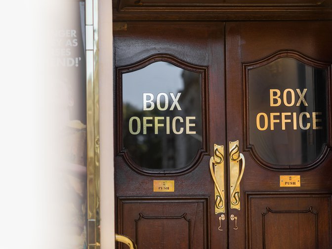
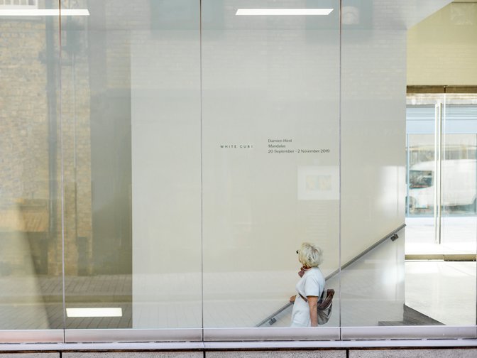
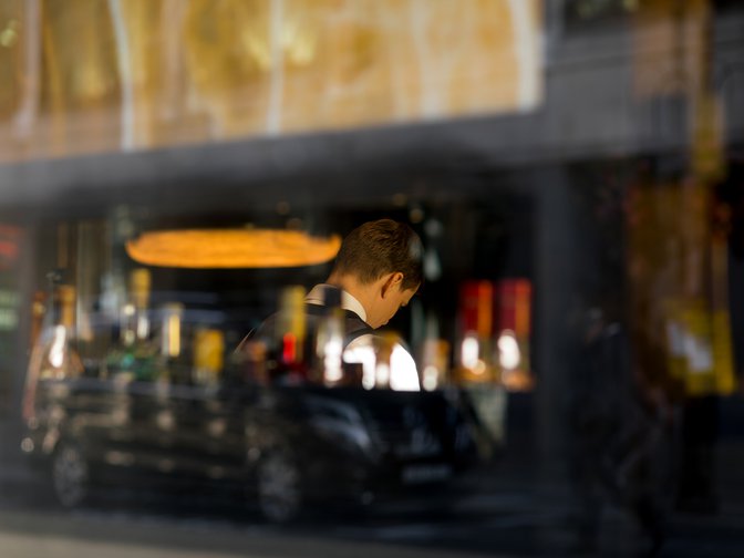
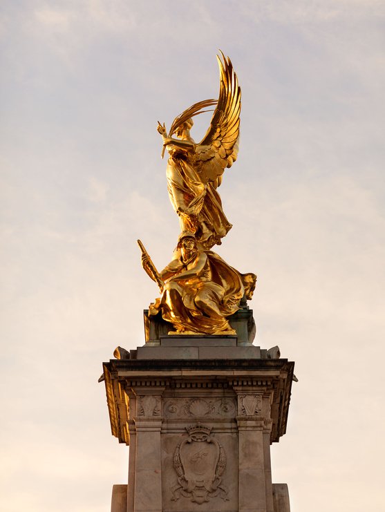
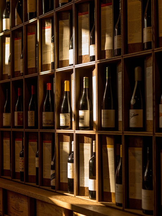
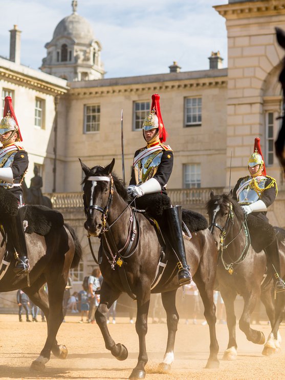
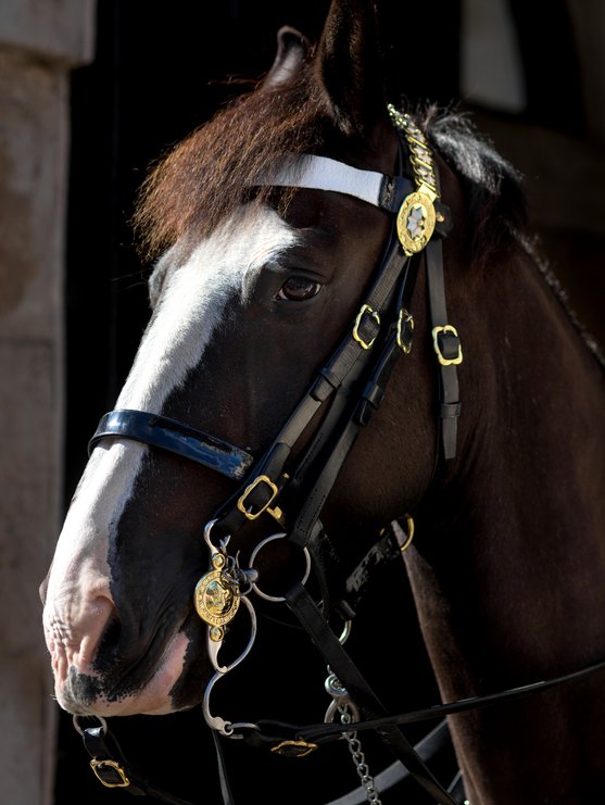
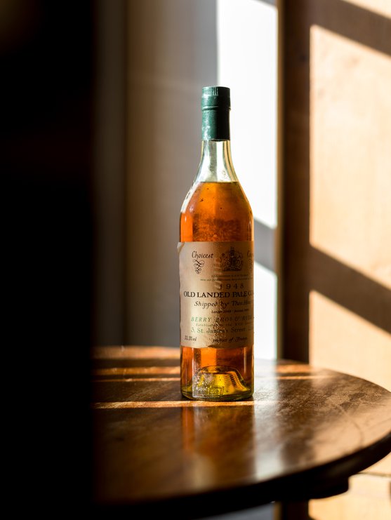
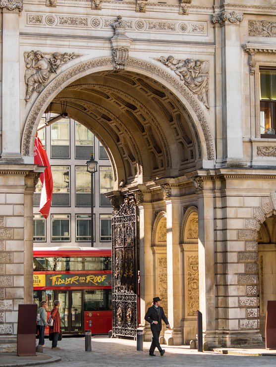
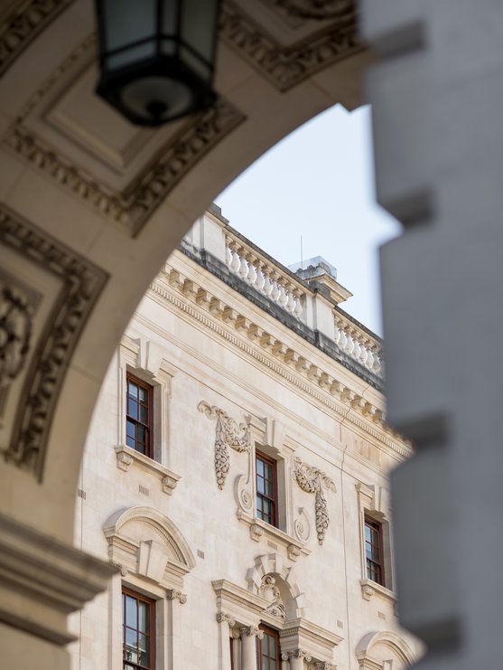
Candid photography captures an illustrious yet vibrant neighbourhood.
Full Screen
1/7
Full Screen
1/8

See more work
